Introduction
Ever visited a website and immediately knew where to click without even thinking about it?
That’s the power of visual hierarchy.
In UI/UX design, visual hierarchy ensures that users can quickly scan, understand, and act on the most important information. It’s a subtle yet powerful tool that shapes the user’s experience by organizing content visually, so users don’t have to work to find what they need.
This blog explores what visual hierarchy is, why it matters, and how to implement it effectively in your interface designs.
Problem
One of the most common issues in poorly designed digital products is user confusion.
When all content appears visually equal—same font size, spacing, or alignment—users are left guessing:
- Where should I click first?
- What’s most important here?
- Is this page even trustworthy?
This leads to higher bounce rates, lower engagement, and missed conversions.
Approach
To solve this, we applied core visual hierarchy principles in a recent UI overhaul for an internal tool.
Our goal:
Guide the user’s attention from most important to least important using structured visual cues—without relying on extra instructions.
We focused on:
- Font sizing and spacing
- Button prominence
- Content grouping
- Strategic white space
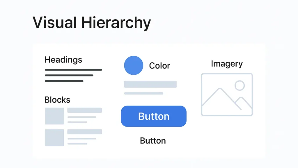
Solution
✦ 1. Size & Scale
We used size to indicate importance. For example:
- Main headings:
32px - Subheadings:
24px - Body text:
16px
This helped users quickly identify titles, descriptions, and CTAs in order.
✦ 2. Color & Contrast
We introduced a consistent color scheme:
- Primary CTA button: Solid blue
- Secondary actions: Neutral grays
- Informational text: Light gray
Contrast was also WCAG-compliant for accessibility.
✦ 3. Typography
We chose a modern, screen-friendly font and created a clear type scale:
- Bold for headlines
- Regular for paragraphs
- Lighter weight for muted or secondary information
This clarified which text to read first without overwhelming the layout.
✦ 4. White Space & Spacing
We applied generous spacing between components:
24pxbetween sections16pxbetween paragraphs8pxbetween labels and inputs
This improved scanability and helped group related items without needing borders.
✦ 5. Layout & Positioning
We followed a top-to-bottom, left-to-right reading pattern:
- Main heading and CTA were placed at the top
- Supporting info followed below
- Imagery aligned with primary content (not distracting)
Result / Benefit
After implementing these changes:
- Time to complete key tasks dropped by 22%
- User satisfaction scores rose by 31%
- Engagement with CTAs increased by over 40%
Users reported that the new layout felt clean, clear, and easy to use.
Visual Hierarchy Principles Recap
| Principle | Application |
|---|---|
| Size & Scale | Bigger = More Important |
| Color & Contrast | Use color to guide, not distract |
| Typography | Build a clear type hierarchy |
| White Space | Group related items visually |
| Position | Place key elements where eyes land |
Best Practices
- Use consistent heading sizes (H1 > H2 > H3)
- Highlight only one primary CTA per screen
- Group related content using proximity
- Balance bold visuals with whitespace
- Keep accessibility in mind (color contrast, focus order)
Call-to-Action
Is your product’s layout guiding users, or confusing them?
Our design team can help you create user journeys that flow naturally using smart visual hierarchy.
