Introduction
Typography is more than just choosing fonts, it’s a foundational element of UI/UX design that directly impacts readability, usability, and emotional connection. Great typography helps users find information quickly, improves comprehension, and creates a polished brand experience.
In this guide, we’ll explore why typography matters in digital products, how to make smart typographic choices, and the best practices that drive clarity and consistency in design.
What is Typography in UI/UX?
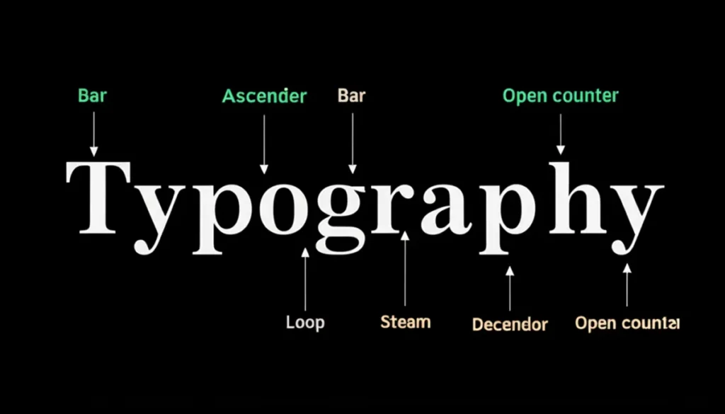
Typography refers to the style, appearance, and arrangement of text. In UI/UX design, it includes:
-
- Font selection (e.g., serif vs sans serif)
-
- Font sizing and scaling
-
- Line spacing (leading)
-
- Letter spacing (tracking)
-
- Text alignment and justification
Typography influences how easily users can read and interact with your product, as well as how they feel about the brand.
Why Typography Matters in UI/UX
-
- Improves readability: Clear, well spaced text reduces cognitive load.
-
- Guides navigation: Visual hierarchy in type helps users scan and find what they need.
-
- Builds trust: Clean and professional typography strengthens brand credibility.
-
- Enhances usability: Accessible type choices help users across devices and conditions.
Key Elements of Good Typography
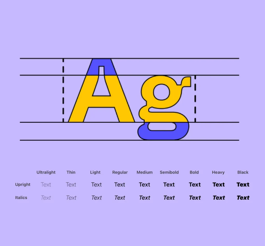
1. Font Selection
Choose fonts that align with the tone of your brand and are easy to read on screens. Sans serif fonts like Inter, Roboto, or SF Pro are popular for digital interfaces.
Tip: Avoid using more than 2–3 font families in a single UI.
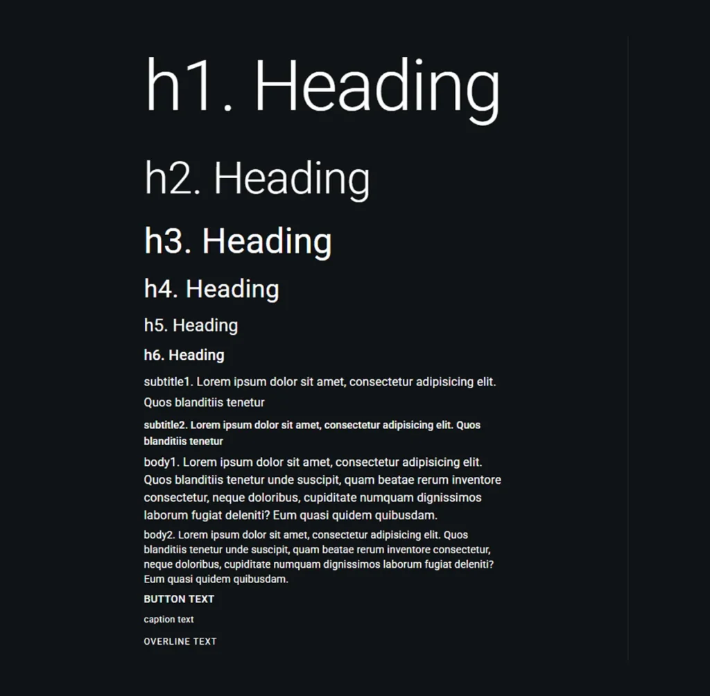
2. Hierarchy
Use size, weight, and spacing to establish clear hierarchy:
-
- Headings: Large, bold, and clear
-
- Subheadings: Medium weight
-
- Body text: Normal size with high legibility
-
- Captions: Smaller and lighter
Use consistent heading levels (H1, H2, H3) for semantic structure.
3. Line Height & Spacing
-
- Line height (leading): 1.4–1.6x the font size for good readability
-
- Letter spacing (tracking): Avoid too much or too little spacing
-
- White space: Let the content breathe; improves scanning
4. Contrast & Accessibility
Ensure enough contrast between text and background.
-
- Use WCAG compliant color contrast
-
- Prefer dark text on light backgrounds or vice versa
-
- Avoid placing text over busy images
Tools: WebAIM Contrast Checker
5. Responsive Typography
Typography should adapt gracefully to different screen sizes.
-
- Use relative units like rem or % instead of fixed pixels
-
- Set viewport based font scaling for mobile devices
-
- Test on multiple screen sizes and devices
Best Practices
Do:
-
- Use web safe, licensed fonts
-
- Create a consistent type scale
-
- Test on real users and devices
-
- Document typography in your design system
Don’t:
-
- Use decorative fonts for body text
-
- Mix too many type styles
-
- Rely only on font size for hierarchy
-
- Forget accessibility requirements
Typography in Design Systems
If your team is building or using a design system, typography should be a core foundation of it. Define:
-
- Font families
-
- Size scale
-
- Weights and styles
-
- Usage guidelines
-
- Responsive rules
This ensures consistency across products and improves handoff between design and development.
Conclusion
Typography isn’t just about aesthetics, it’s about creating clarity, focus, and trust. When done well, typography elevates your UI from good to great. By mastering font selection, visual hierarchy, spacing, and accessibility, designers can build interfaces that communicate effectively and feel effortless to use.
Call to Action
Want to strengthen your product’s typography or audit your current UI for clarity and consistency?
[Connect with our UI/UX team], we’ll help you build a polished, readable, and user friendly experience.

The sentences carry a natural, flowing cadence, encouraging patience and reflection. Ideas unfold gently, allowing insight and emotion to emerge organically, producing a serene and immersive reading experience.