Introduction
Creating an effective layout is the backbone of any great digital product. Whether it’s a website, mobile app, or dashboard, a well structured layout ensures users can navigate seamlessly and focus on what matters most. This guide explores different layout types, grid systems, visual hierarchy, and best practices to help you design user experiences that are both functional and visually appealing.
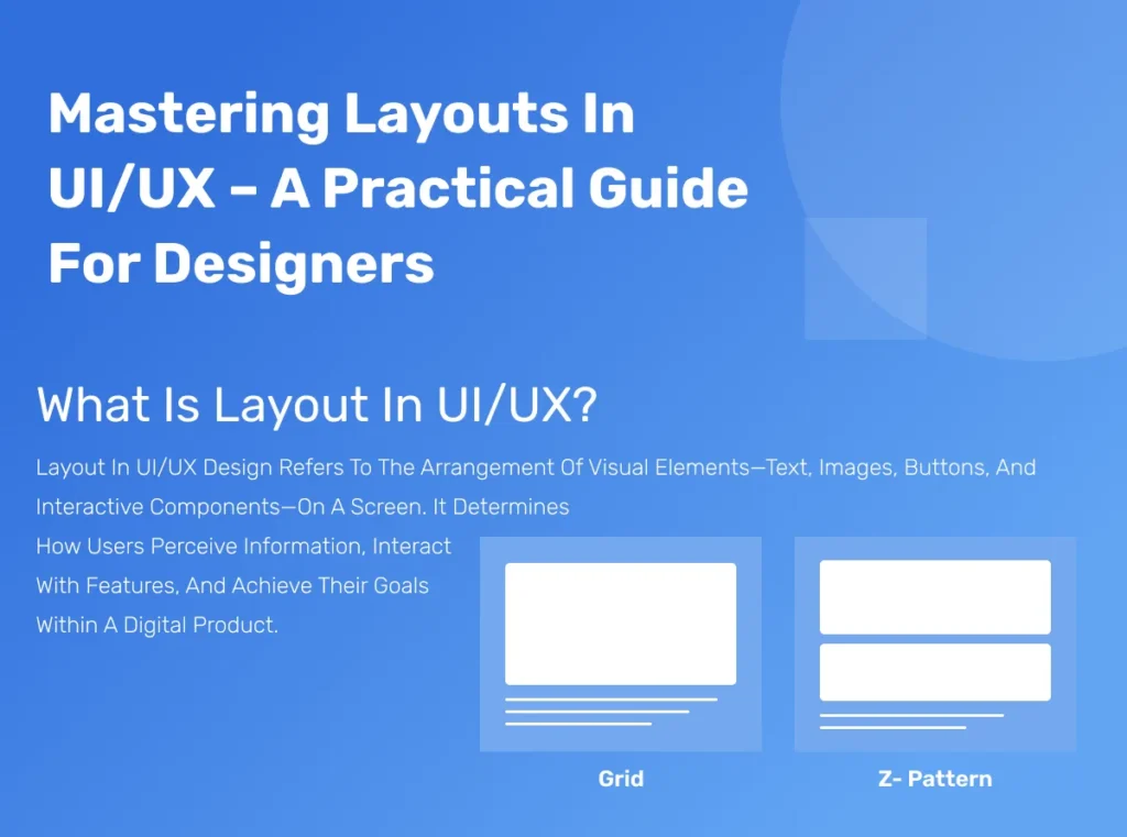
What is Layout in UI/UX?
Layout in UI/UX design refers to the arrangement of visual elements text, images, buttons, and interactive components on a screen. It determines how users perceive information, interact with features, and achieve their goals within a digital product.
Role of layout in UI/UX:
-
- Guides user attention toward key actions or content
-
- Improves readability and reduces cognitive load
-
- Enhances the overall aesthetic and brand perception
-
- Ensures consistency across multiple devices and platforms
Types of Layouts
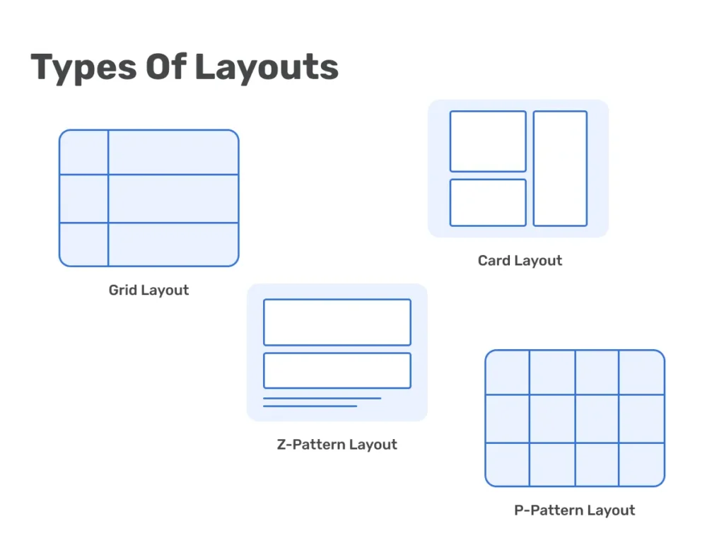
Grid Layout
A foundational system where content is arranged within rows and columns for balanced alignment.
Z Pattern Layout
Ideal for pages where users scan content in a “Z” shape, common for landing pages and marketing banners.
P Pattern Layout
Follows an “F” or “P” scanning path, typically used for text heavy interfaces like blogs or news portals.
Card Layout
Displays content in modular, card like components, great for dashboards, product listings, and mobile apps.
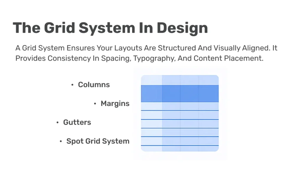
The Grid System in Design
A grid system ensures your layouts are structured and visually aligned. It provides consistency in spacing, typography, and content placement.
Key elements:
-
- Columns – Divide content into equal vertical sections
-
- Gutters – Space between columns for breathing room
-
- Margins – Outer spacing to prevent content from touching screen edges
-
- Spot Grid System – Framework to ensure precise alignment and responsiveness
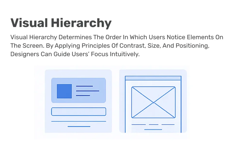
Visual Hierarchy
Visual hierarchy determines the order in which users notice elements on the screen. By applying principles of contrast, size, and positioning, designers can guide users’ focus intuitively.
Tips:
-
- Use larger text and bold colors for primary actions
-
- Place crucial information at the top or center
-
- Apply consistent spacing to avoid clutter
Best Practices for Effective Layouts
Do
-
- Ensure consistency in typography and spacing
-
- Use white space strategically to avoid overwhelming the user
-
- Prioritize content based on user goals and business objectives
Don’t
-
- Avoid unnecessary transitions or animations that distract users
-
- Don’t overcrowd elements, give each component room to breathe
-
- Prevent content from appearing in random order without hierarchy
Conclusion
Mastering layouts is not just about aesthetics, it’s about creating seamless user experiences that improve engagement and conversion rates. By using grid systems, understanding visual hierarchy, and applying proven patterns, you can design layouts that resonate with users and support business goals.
Call to Action
Looking to enhance your UI/UX skills or need expert help designing user friendly layouts for your product? Contact our design team to bring your ideas to life with modern, conversion focused UI/UX solutions.
