As a full-stack developer, I’ve learned that technical debt doesn’t just live in the backend or database. It’s alive and well in the frontend too, especially when your UI is built without a plan – and you suddenly find yourself staring at a mountain of duplicated, inconsistent, and hard-to-maintain components.
In one of my recent projects, we reached that tipping point. The UI had become a patchwork of mismatched components: buttons styled five different ways, modals duplicated across modules, and inconsistent design tokens sprinkled throughout the codebase.
It was time for a major refactor – not just to clean things up, but to create a scalable design system that could grow with the product.
Here’s how I approached the process, what worked well, what challenges came up, and why I’d recommend every team invest in design system thinking early.
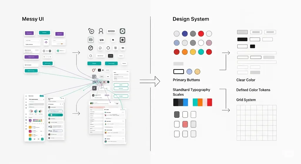
The Problem: UI Chaos
At first, everything was moving fast. We were shipping features quickly, building components on the go. But over time, that speed created fragmentation:
- Multiple versions of buttons and forms
- Inline styles competing with CSS modules and utility classes
- Lack of naming conventions
- Components copied and slightly edited instead of reused
The result? Slower development, more bugs, and UI inconsistencies that users were starting to notice.
The Goal: A Scalable Design System
Our mission was simple:
Refactor the UI into a reusable, consistent, and developer-friendly component system.
This meant:
- Unifying design tokens (spacing, color, typography)
- Creating atomic, flexible components
- Reducing code duplication
- Making the system easy for all developers to use
We didn’t aim to create a full-blown design system like Material or Carbon – just something custom, simple, and scalable for our needs.
Step 1: UI Audit & Inventory
First, I performed a full audit of existing components. Using tools like Storybook and React DevTools, I catalogued:
- All buttons, inputs, modals, cards, etc.
- Variants and inconsistencies
- Style overlaps and custom tweaks
We identified over 20 “unique” button instances, many of which were nearly identical except for color or padding. Clearly, we were long overdue for consolidation.
Step 2: Define Design Tokens
We worked with our designer to extract and define design tokens – standard values for:
- Colors (primary, secondary, accent, etc.)
- Typography (font sizes, weights, spacing)
- Spacing units (margins, paddings, gaps)
- Border radii, shadows, etc.
These tokens became the foundation of every new component. We stored them as variables in a centralized SCSS file (or Tailwind config in some cases) to ensure global consistency.
Step 3: Build Atomic Components
Next, we rebuilt the UI with an atomic design approach, starting with the smallest elements:
- Atoms: Button, Input, Label, Icon, etc.
- Molecules: Form groups, Dropdowns, Cards
- Organisms: Modals, Header sections, Tables
Each component was:
- Reusable: Accepts props for size, variant, icons, etc.
- Composable: Can be nested inside other components
- Themed: Uses tokens, not hardcoded styles
- Tested: Basic unit tests to catch regressions
Example: Our new Button component handled all variants (primary, outline, ghost) via a simple prop, and included built-in loading and disabled states – no more one-off buttons with inline spinners.
Step 4: Gradual Refactoring
Rather than doing a massive, high-risk rewrite, we applied the new system incrementally:
- Wrapped the old UI in a component provider with global styles
- Replaced one section at a time during feature updates
- Deprecated old components with warnings in the code
This allowed us to clean up the UI without blocking new feature development.

What Worked
Design Tokens
Centralizing design variables made everything more consistent and easier to maintain. Changing a color or font size became a one-line update.
Reusable Components
The new components drastically reduced repetitive code and made the UI easier to scale across pages.
Documentation & Examples
We created a small internal Storybook to showcase available components, props, and usage examples – this helped other devs adopt the system quickly.
Challenges & Gotchas
Over-Engineering Early
There’s a fine line between making components flexible and making them overly complex. In the beginning, I added too many variants and props “just in case.” Simpler was better.
Naming Conflicts
Renaming old components and avoiding clashes during migration required careful coordination. A few times, we accidentally imported the wrong version of a component.
Breaking Changes
Refactoring shared UI across a big codebase always introduces risk. Even with testing, we ran into layout issues that were hard to track down. Proper versioning and communication were key.
Results
After the refactor:
- UI load time improved by ~15% due to smaller, leaner components
- Bundle size dropped by ~20% after deduplication
- Developer onboarding became faster (less confusion)
- Visual consistency improved noticeably – even users commented!
Final Thoughts
Refactoring the UI into a scalable design system wasn’t just a cleanup task – it was an investment in long-term stability and team productivity. It’s easy to ignore frontend technical debt until it slows you down or breaks the experience. But with a structured approach, even a messy UI can evolve into a solid, reusable system.
Call to Action
Working with a UI that feels more like a Frankenstein project than a product? Take the time to refactor – it pays off. And if you’re tackling a similar design system refactor, I’d love to swap ideas!
